Happy Birthday, AIDS!
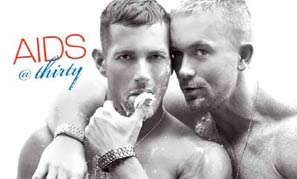
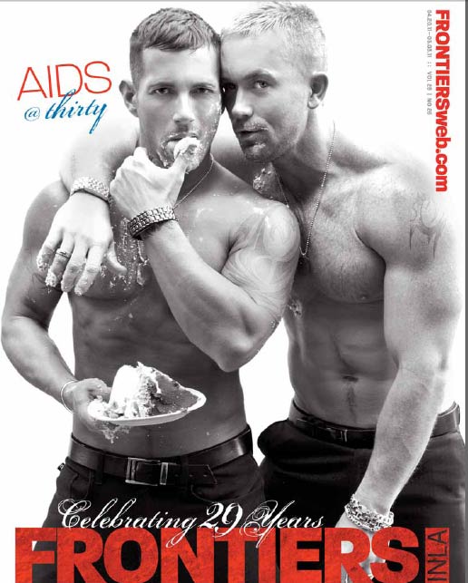
Frontiers, the southern Californian fag rag you thumb through while getting drunk at Hamburger Mary’s, is celebrating its 29th anniversary by honoring the 30th anniversary of AIDS, and what better way to mark the recognition of a deadly disease that not only stigmatized an entire community but also is still killing people today, 30 years later, than with two circuit bois eye fucking you while smearing party frosting all over each other? Sexy, and just fun fun fun!
The cover:
It’s not just the guys and the cake, it’s also that font (thirty!), which tells me that Frontiers thinks there’s something about AIDS that we should be celebrating. Maybe it’s just tacky and not actually offensive, but more than anything, it’s misleading, isn’t it? Guys like the ones on the cover don’t look like they have AIDS, but maybe they do have AIDS, and that’s what we’re supposed to celebrate: the new face of AIDS. Even though you–in your tight dress slacks and your belt and your no shirt–got AIDS when you went on that crystal binge at that circuit party and will now be on medication for the rest of your life, AIDS is manageable. Don’t believe it? Just ask any of the dozens of pharmaceutical companies that have been advertising their HIV medications in Frontiers for the past 20+ years. So, relax. Celebrate! You can, as it happens, have your cake and eat it too.


From an art director’s viewpoint it’s just a bad design. It looks to be a deliberate attempt to mix and confuse two messages. The script font is used in both the AIDS message and the Celebrating message which joins them together. If the editors don’t understand that by now then perhaps they’ve been at this for 29 years too many.
This is a simple cover layout/typography issue. It appears that they meant to highlight the celebration of their 29th year but because they added the AIDS tag it appears its AIDS they’re celebrating.
One would think after 29 years they would understand a little bit about layouts and the need to clearly articulate the message through placement of type. It should be OBVIOUS to the casual reader to understand that inside the magazine there is a story about AIDS after 30 years…but it isn’t obvious. It isn’t obvious and those fonts are terrible.
That’s pretty much it, a bad layout highlighting the wrong thing.
Zach,
I completely agree – this is vapid, tasteless and completely disrespectful of the millions of people who have died from this plague. Who the fuck cares if this is a mixed status couple? portraying AIDS as a sexy party with a couple of tired circuit queens is disgraceful and clueless. Fuck Frontiers magazine.
JFC it looks like an AIDS contaminated font is thiclose to sting the model in his ear and infect him by the time he turns 30….what the hell were the editors thinking?!
CakeyPopTwinks.edu
My first reaction was that a birthday party for AIDS is appalling…My second was did the models know they were going to be featured on the cover with that tone? I bet they thought they were going to be featured on a anniversary cover and were surprised that it was an AIDS cover. That isn’t a cover you are going to add to a portfolio as a model.
Oh, and: best comments EVER.
What the hell? 1st it was AIDS kitsch, now its this?
Thank you for calling out the weird fetish of HIV related marketing crap, as what it is: crap.
And I’m being kind here.
It is true you catch more flies with honey than with vinegar. If the cover isn’t interesting, no one is going to pick up the magazine – I think they did a good job of appealing to their market even if it’s not my personal taste. Perhaps it would be best to find something more constructive and supportive to the community to blog about as opposed to tearing down a publication because you don’t like their cover.
Have you EVER been to The Sword?? That’s kind of like what we do.
R.I.P. irony
I’m trying to come up with a nuanced response to this, but someone distracted me with the promise of Cake Pops. (Which my family has been doing without the stick as “cake balls” for years. *Cooler than You.*)
Wow — will ya look at all these fun comments?!
You guys took AIDS and made Lemonaids!
Good for you, guys!
YES!
Fucking wretched.
the cover is so especially full of LOL b/c any tweaked out FAGGOT worth his weight in CRIXIVAN knows gay men wouldn’t be caught DEAD eating an old-fashioned cake like that.
WE ONLY EAT CAKEPOPS NOW
LOL and duh x 1,000
I LOOOOOVE CAKE-POPS!!
whats a cake pop?
A cake pop is a little cake ball on a stick that they serve at Starbucks. Yum
LET THEM EAT CAIDS!
WIN.
Politics / story / emotional baggage of HIV aside: a shot of two “hot” guys rubbing cake on their faces & “hot” bodies is, frankly, fucking retarded and does not belong on the cover of any magazine, unless it’s some fetish thing like Cake Farts Quarterly. IDEK!
Mixed status activist couple? That sounds awesome!
Doesn’t take away from the fact that the cover of this magazine defines the very concept of “EPIC FAIL”.
And here I thought Queerty was the only site to post about something before actually looking into it. Perhaps you should actually pick up the issue and read it (instead of thumbing through it) while you’re indulging in the blue fishbowl drinks at Hamburger Mary’s.
And I’m surprised by the audacity of a site like The Sword, which lures readers in with pictures of dick and ass, having anything negative to say about using sexy models to ‘sell’ a product, the product being the print magazine. (I find it funny that I even have to say that, considering I’m typing this while a porn star’s penis stares me in the face from an ad to the right of this text box.)
Furthermore, shame on you for suggesting that we here at Frontiers (I’m one of the magazine’s two editors) feel AIDS is something that warrants “celebration.” What’s being “celebrated” on the cover is that a local gay publication, which consistently provides the SoCal LGBT community with coverage on important issues (including HIV/AIDS), has survived for 29 years. Let’s hope The Sword can someday say as much.
Showing that people living with AIDS are hot is fine, but portraying AIDS as a sexy party (which is how I read the cover) to people who don’t have it–to people who are drunk in a bar and undoubtedly not reading the articles inside–is irresponsible.
And if you think I’m criticizing your cover simply because it uses sex to sell a magazine (btw, isn’t Frontiers free?), you need to read what I wrote again.
I think it’s fairly apparent to the majority of our readers that this is our (double-sized) anniversary issue (hence the ‘party’ and ‘cake’), which is something else you might actually know if you bothered to pick up the issue before letting your astute readers know what’s inside. Nowhere is the AIDS virus portrayed as a “sexy party,” and if that’s what you read from our cover, perhaps the ultimate issue is with you. How ridiculous.
I’m not sure how much time you spend in Los Angeles-area gay bars, but I have yet to see “drunk people” reading our magazine in bars, and I’ve been here almost a decade. In fact, referring to Frontiers as a “fag rag” in your opening sentence goes to show you don’t know much about this three decades-old publication in the first place.
Perhaps The Sword should stick to reporting on porn stars and films, and not spend its time ragging on organizations that put their life blood into helping the LGBT community. Not that “who’s fucking who” isn’t important — I’m just saying.
Why is ‘cake’ in quotes? Is it not real cake?
Since you are the editor of a magazine with serious journalistic integrity I’m going to give you the benefit of the doubt and assume you meant to write “Who’s fucking whom”.
So, Miss Editor Thing, putting “AIDS@Thirty” in cute party font in the top corner of the magazine above the cover image is somehow supposed to make us NOT think you’re celebrating it somehow?
I think you are really just going to have to bite the bullet and admit that you MASSIVELY FUCKING FAILED with this one. There is absolutely ZERO reason for that to have been put on the cover of your anniversary edition.
Sorry, dude, but you’re just totally fucking retarded. Worst. Editorial. Decision. EVER!
I just spoke to him, and it turns out the penis was actually looking away in disgust.
Hilarious.
The guys on the cover are a mixed status couple who are working together to raise AIDS awareness and money for AIDS research. They happen to also be pretty, which sells magazines. You can read their interview with the magazine on their website.
http://www.mattschiermeier.net/2011/04/frontiers-magazine-interview/
No thanks.
It has been argued that “The Look” in 80’s / 90’s Gay Porn (the oven baked over muscled look) was a direct response to the Aids Hysteria. The claim was that the studios were trying to get a look that was the opposite of the look associated with being sick and having Aids. However, as you correctly point out, Looking Tan and Muscled didn’t keep anybody from dying.
Your reaction to this Frontiers issue is about equal to my reaction to the description of the proposed Joey Stefano bio flick. The “blurb” on the film presents Stefano et. al as this Gay Porn Rat Pack that partied from Coast to Coast. If you ignore the fact that guys were dropping dead all around them then, Yeah, Stefano & Company were kinda like a Gay Porn Rat Pack.